FloraFlex’s hydroponic nutrients keep your plants happy and healthy.
CONSUMER PRODUCTS![]()
![]() PACKAGING
PACKAGING
The Idea
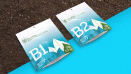
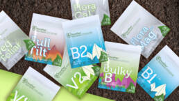
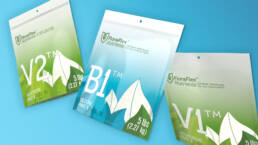
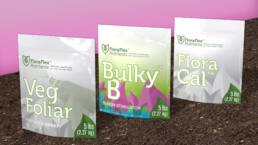
Pulse has done extensive work with our friends at FloraFlex over the years, developing 1000s of products, packagings, support graphics, apps and websites. Usually, Pulse’s designs are true to the brand, in a vibrant shade of FloraFlex green, seamlessly fitting into any grow room. For the FloraFlex Nutrients line, however, it was decided to GO BOLD to break the mold! A captivating deviation from the conventional, this packaging is clad in bright colors and playful gradients. Designed to stand out from the the crowd, FloraFlex Nutrients are bright and fun, contrasting the typical masculine aesthetic associated with the cannabis industry.
Take a peek.
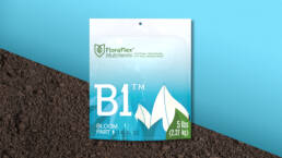
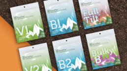
Pulse didn’t stop at color. We continued to explore further ways in which to create the best packaging for this product line. Notably, the innovative inclusion of a transparent window on the front of the V1, V2, B1, and B2 nutrient packaging grants consumers a tantalizing glimpse of the enriching contents within.
Teammates, not competitors.
The vibrant colors and gradients used in the nutrient packaging design are fun and attention grabbing, while still remaining professional, clean and premium. Although these colors are deviations from the typical FloraFlex green, they work in tandem with the existing product line, not competing with, but contributing to the brand as a whole.